Tuesday, 22 January 2013

Research into Aesthetics: Part 5 (Mood boards)

I want the assets that i design to be an interesting type of the game design for phenotype. I also want it to be a man made structure, as this is an area of both 2D design and 3D modelling that i feel i need to improve on, and wish to test. For BA4 Nathan Russel created a 3D model of one of the types of tunnels that connect the main parts of the building together. 

(map design by Nathan)

i will roughly be basing my room/area design off Nathans Map design, but with greater emphasis on my own vision for the world. I want to design a unnecessary part of the environment, as i feel that focusing on designing the tunnels was a bit of an unnecessary way to display our design ideas. An important part of the game design of "Phenotype" focuses on the customisation of characters. this is done in an "engineering room" in the game, which players must enter in order to update and or alter their characters appearance or moves in any way. the pretext of this in the game would be that when the creatures enter a specific device (like a cloning tank) their tissue and DNA dissolves (of the limb they are replacing) and is re-constructed onto the body out of fresh tissue and DNA.

I am using this scene from Prometheus as inspiration for what goes on in this tank, i think having different kinds of media will help me in creating a design that is iconic.

(clip explaining how the DNA corruption scene in Prometheus was created)

The assets that i am going to design will be part of this room set up. i want to design a variety of of props to populate the room, though i only intend to produce the engineering chamber itself as as a 3D model. it will be useful to have contextual designs of other props and the setting pf the assets to show a coherent design style and design progression.

I have started to collect inspirational images, and create mood boards. this is my progress, and thoughts so far:

(The Force Unleashed 2 trailer: still) 

(The Force Unleashed 2 trailer: still) 

I have looked at the game "The Force Unleashed 2" as my first inspirational material. I thought that the prevalent themes of cloning in the game would provide some interesting references. I like the use of color blue colored lighting in this environment, it provides a contrast between the dark metals and darker shadows in behind them.

I do however want to be considerate in my use of design cliche's, as i have mentioned earlier, the use of lighting in this way is common in science fiction, and i think, bordering on over-use.

I also like the design of the cloning tanks themselves, though the form is based on a simple cylinder, the large area of glass viewing screen frames the body's in the tanks well. This is an important functional aspect within the game that i need to consider. Part of the porousness of the tank is to display the players creature in an easily readable manner so they can make aesthetic adjustments through the customisation systems within the game. It would be poor design if the creature was obscured by part of the tank, impeding the players view. 

There are 8 different playable races, each with 4 different style variables, and each of those with a further 4 variations of form (in the form of stages of the life cycle). I want to make sure my design can comfortably accommodate these designs, so that the design of the chamber will can remain consistent, therefore the containment space within the tank must not be too constrained.

(an example of the variations of one faction- Ba4)

Again, blue glowy lighting is a common theme here. This is kind of a visual prompt for myself to look closer at the art and design of avatar, initially at the industrial design aesthetic, but also at the use of human- machine interface. this will become very important for my later design work. 

i like the shapes used within these objects (the tanks) they look simple and functional, yet clearly serve the purpose of framing the avatar inside. The top image is something i must try to stay away from, the container hugs the form of the character like a coffin. this design seems to be created from an ergonomic perspective, trying to comfortably contain the human within. A design of this type is too limiting of the shape of the occupant, as such it wouldn't work well as a vessel to house a wide range of differently shaped creatures. 


This is my first mood board, for this collection of images, i wanted to put specific emphasis on form and shape. I envisage the main bulk of pod/ chamber i design to be symmetrical through both the x and y axis. i tried to look as related objects for the most part, with some more obscure images  as inspirational shapes. 

I first searched for objects related to the subject of my design, containment "pods" i gathered references of "cryo pods" from both alien and Prometheus. i wanted to keep a common, coherent theme through my research. To that extent i looked for imigary of "sleeping pods" as well as medical devices that are designed to "contain" the human form such as ct scan machines. from there i followed on with further images of medical equipment because of the visual links to operation and clinical environments. 


G.D.D Revision 1

Though i was relativity happy with what we produced as a team for Ba4, particularly in teams of game-play (playing styles, customization, and factions all worked really well) i think there was an inconsistency between our reference material, concept art, and final 3D renders of the game environment. Looking back on the work produced for this project, i can try to see where these elements went wrong, so that i can try to improve, and also not make these mistakes this time. 

As i progress with my designs i will amend parts of the design document to make it my own work, finally producing a re-imagined design procurement coherent to the work i will produce. 


Research into Aesthetics: part 4

Analysis of related works:
As part of my research for BA4 I looked at the art and design of "Prometheus", "Avatar", and the "Star Wars" franchise. Placing particular emphasis on the design of the man made elements in these works, i created a collection of images for reference, 

Looking back, it seems that there wasn't enough communication between the team and myself, of the design elements in the mood/characteristics references and what i wanted to take inspiration from. i realise now the need to make more detailed notes alongside such images to correctly convey my vision. when not working in a team, as with this project said notes are equally important to help maintain a coherent design aesthetic, and to give me something to refer back to when i need to cross check a design idea. 
My notes should, take into consideration, form, color, characteristics, technique, mood and more.

(The art of Avatar)

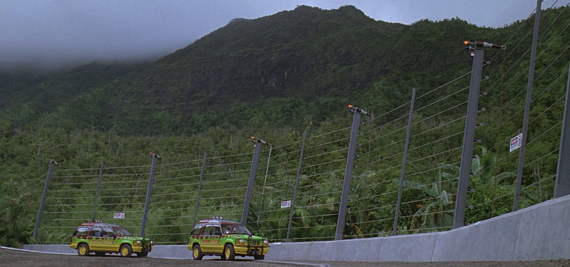
I chose this concept art piece from avatar as an example of the technology level that i thought would be appropriate in the game. I wanted the design to be somewhat fantastical, but within the realm of believability  The picture reminded me of a discussion we had had as a team, about using Jurassic park for some reference material, as it shared some story themes, like the bi-engineering (in this case cloning) of dangerous animals, and their containment. we thought that we would have to design similar levels of security in the animal enclosures.
i have continued this research (that i started in the last project) to find examples of the images that sparked the these ideas.


(Jurassic Park)

(Jurassic Park 3)

(The art of Star wars the Clone Wars: Kamino design)

It was the stetting of this painting that primarily interested me. I thought that within the story of the game, it would make sense that the facility (the stetting/environment of the game). I also wanted to use these buildings as a reference for the scale of the environment we were creating, based upon the idea that as we were designing a large scale MMORPG game, the towers, and forms of the buildings, and the expanses of testing facility's in the facility would effectively form what would be the mountains, hills and plains such games that are set in more traditional locations.

From that point, i imagined that the buildings would be based off some kind of tier/ level structure, i thought that this would create an interesting game environment to play in, and would produce a large amount of available play-space for a game with an indoor setting.

A design incorporating the aesthetic/ layout of the Kamino buildings (above) and some structural inspiration taken from paintings of the Tower of Babel, or the film design of Minas Tirith from the Lord of the Rings franchise. 


(Tower of Babel)

(Minis Tirith: The Lord of the Rings)


(The art of Star wars the Clone Wars: Kamino design)

For this sketch (above), i also wanted to give an example of the scale of the building, i thought the use of characters in the picture would give a better indication of scale and perspective.


(The art of Star wars the Clone Wars: Kamino design)

I liked that this image went into further detail of the buildings. the perspective of the picture, ad the organic curves give the buildings the same profile a rolling hilly landscape would have as it turned to a mountainous region. it was this picture that provided me with the visual link to connect the use of large scale buildings and their forms as the actual landscape and its environmental landmarks.

(The Art of Prometheus: ship interior)

(The Art of Prometheus: ship interior)

These images from the concept design of the ship Prometheus from Ridley Scott's film of the same name, also provided examples of the level of technology that i thought would be appropriate for the game world. Prometheus is set in 2089, a similar time in terms of technology (theoretically) as the setting for Phenotype, and as such provided the best template to work from.

The Prometheus and Alien franchises also provided a good deal of reference in terms of mood. Unfortunately i neglected to source any images of the man made design in Alien (the spaceships and buildings) and used it more as a guide for the design of organics within the game as this also fitted the dark design ethic we wanted to stick to.

For this project i will be designing the interior of a room, which is inherently a man made structure. therefore it is important that i gather further reference images, for concept art and mood paintings that are more applicable to me now. I still feel that these reference points are compatible and relevant to my vision of the assets that i intend to create, i want to gather fresh resources from these areas and more that i think will help me in a manner more specific to my BA5 project, as i don't want to rel solely on the material that i had gathered previously.

Research into Aesthetics: Part 3 (Sci-Fi Tropes)

"Open the pod bay doors, HAL..."
When i think of "retro" science fiction films the first thing that leaps to mind is 2001 A Space Odyssey. Undoubtedly a classic of the genre and of film making in general, it sets the visual cornerstone for visual design in modern sci-fi. This is the film (and aesthetic) i had in mind when i chose to base "Phenotype" off "hard science fiction". 

For me, it has always stood out for its believable design, which in turn, in turn helped me to engage with and believe in the situation and roles of the of the characters. 


The abundance of clean, simple, white surfaces in the 2001 spaceships gives them a sterile, no nonsense feel, and the technology, though dated in comparison to modern standards is very reminiscent of actual spacecraft of the time. 


It's clear that a great deal of care was taken in the design of the film to make it feel authentic, and genuine. Researching the design of the film however, lead me to discover that Stanley Kubrick (director) went as far as employing Frederick Ordway, and  Harry Lange, (who had worked with NASA on vehicular concepts) as consultants. 

Visual tropes and motifs are commonly used in many genres, as a way of providing recognizable themes (colors, shapes, and effects) that the audience can pick up on to quickly understand the type of style that the design team is going for. For example, white (in the western world) tends to denote purity, clean, modern design- the design ethic that company's like Apple tend to follow, when accompanied with simplistic, minimalistic forms this gives a clean "futuristic" look. 


A Dystopian Future:
Post Apocalyptic settings are a common (some might say over-used) sub-genre of science fiction, the setting is an example of a dystopia. As with many others it often uses common visual themes and devices to to quickly set up the scene. 

(The Road)

(Fallout 3) 

(Borderlands)

The common theme here is obviously brown, lots of brown. In contrast to the pure symbolism of white, and its use in entertainment media, brown is used to suggest everything dirty and dilapidated. Thus is a commonly recurring theme in a variety of different media platforms.

Miss-matched, salvaged components, combined in an improvisational manner is also typical of this genre. from, vehicals to buildings to clothing, this style of design will immediately scream post-apocalyptic to most discerning audiences without the need for description. I mention this, as i think it is a useful way of none verbal storytelling and scene setting that can be used to tell an audience that something bad has happened, but sill withholding story details.This technique shows extreme age of an object, or at least high usage.

(Mad Max)

It is important that i bear this use of detail in mind in the designs of my own props and setting. Correct usage of color, and knowledge of their connotations is also important for both 2D and 3D artists. I have found a useful chart that shows the various meanings of  colors to use as reference points for my future work.


"Dont follow the lights..."
This next one is one of the more recent tropes used in the sci-fi arsenal. There is a current trend in science fiction of using an unnatural light blue light as a signifyer for anything scientific, technical or other-worldly, again, this theme spans various different mediums. 

interestingly however, If i look at the chart, the color seems to denote tranquility, peace and wisdom over technology, I also know that blue also indicates cold temperatures.This leads me to deduce that colors have different meanings and uses dependent on their application, location and various other factors. it looks like more color theory is in order.

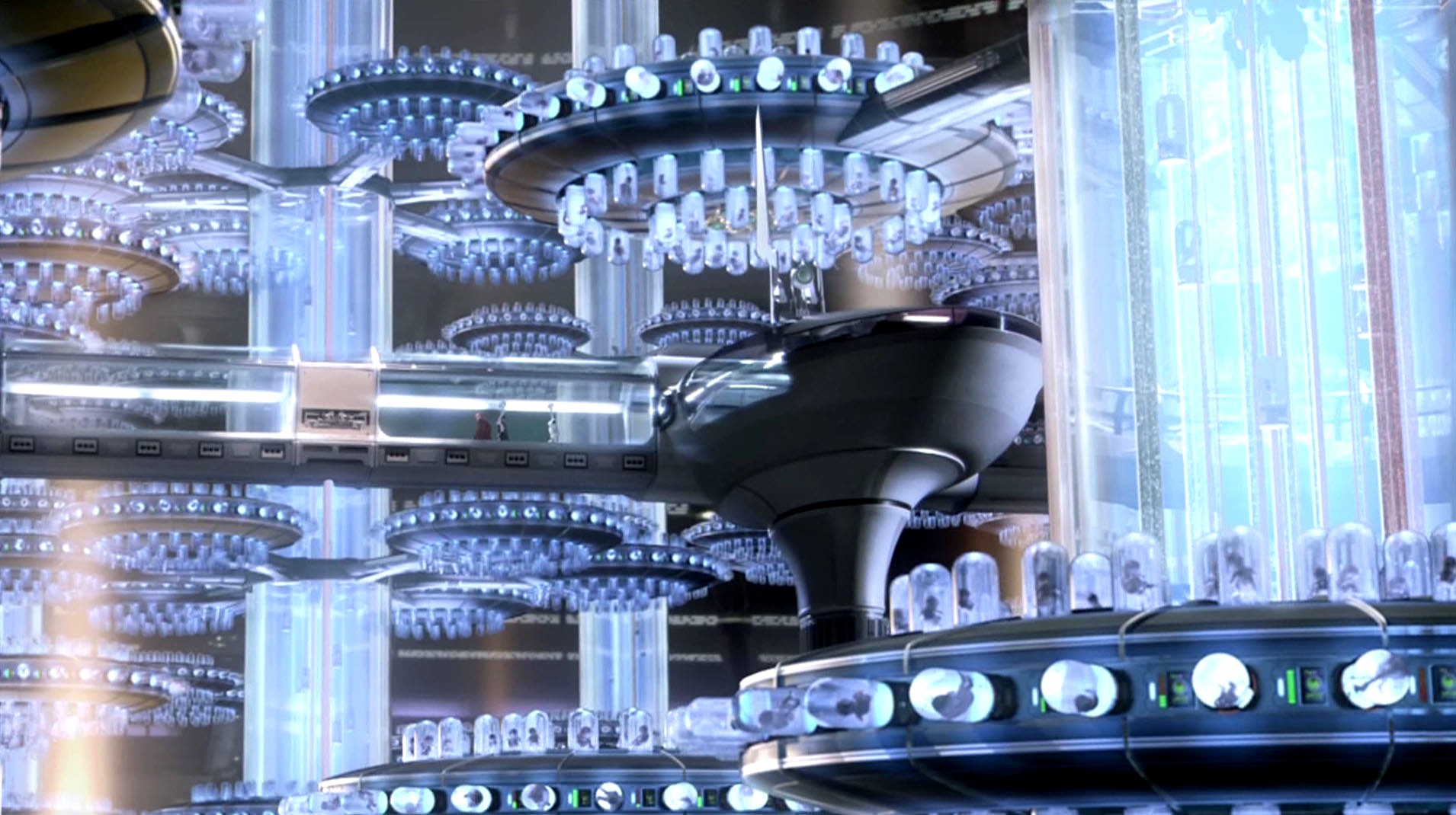
(Star Wars, Attack of the Clones: a cloning facility screenshot)

- A cloning facility is obviously a place of high levels of technology  
- the light area and bright light link to my previous comments on the use of white in sci-fi

(Skyline)

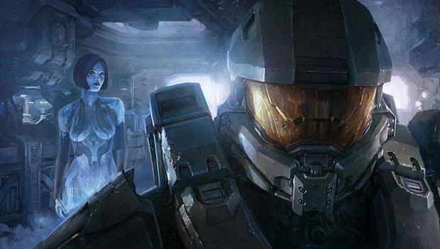
(Halo 4)
- The character in the back is a hologram, again this is a futuristic technology


(Iron Man suit)
- Though the suit itself is red and gold (which of course have different meanings), the light emitted from its power source has a light  bright blue glow
- more than just examples of use of color  these are examples of the use of lighting, and its combined uses with lighting.

An obvious example of how this tool has begun effect the design of sci-fi, is the 2012 remake of "Total Recall". 
Origional (1990):
(Total Recall 1990)

Remake:
(Total Recall 2012)

The second image looks significantly more sophisticated, all thanks to the use of certain devices that bring the visual feel of the film up to date, and in line with public expectations.

By keeping in mind these, and other formulas of the genre, and knowing the correct place to use them, i can begin to design contemporary looking environments, or use this knowledge to subvert expectations of the genre. 

Because i feel that my research for BA4 was such a week point in that project, i think it is particularly important  this term that the research my reflective journal (this blog) is thorough. This is a key aspect of my revision of BA4, as i feel that there are many areas in our design that would benefit from greater consideration, research, and reference.


Monday, 21 January 2013

Research into Aesthetics: Part 2

Industrial design and architecture: Image analysis
 for this stage of my research i have done some image collecting, i want to look at real world "industrial style designs and take from them common themes of, form, colors  materials ect that i can use in my own designs. i intend to analyse a range of images that i feel typify the design aesthetic.


Picture 1:
i found this picture online of some "grungy" industrial looking structures, i have cropped it to isolate the parts of the photograph that interested me. I thought this section emphasized the no nonsense aesthetic of industrial designs. i have taken particular note of the materials used in the picture, and how they are implemented in the construction. the air duct (if that is what it is) appears to be made from a sheet metal (aluminium or steel- this will be usefull to take into consideration when looking at textures to use for my own concepts and model) simply riveted together. both structures are supported with steel struts or beams. i want to take structural support into consideration in my own creation to help it to feel and look technically feasible. it also shows me an example of how rust forms on surfaces - this will be a useful reference if i wish to add "ageing" detail to the texture of my asset. 


Picture 2
This crop also is simply an example of materials and textures used in an industrial environment, it is also from the same source photo as picture 1. Corrugated sheet is often used in such constructions as it increases the strength of the surface from one direction. This building is obviously very bland and reminds me that i will have to strike a balance between function and form in my own designs, function (so that the assets work in the game, and the aesthetic feels realistic) , but without neglecting form (making sure the environment is an interesting, distinctive, and attractive place for the player to inhabit. 

This kind of design is common among "realistic" first person shooters like the Call of Duty franchise, and is tailored  to appeal to an audience who wants who favors a "gritty realistic" gaming experience. I an aware that this kind of design ethic would, for example not be applicable to a game aimed at a younger audience.


Picture 3
I thought that this image would illustrate the common use of repetition of shapes in industrial architecture. Cargo containers are one of the simplest forms of tessellating shapes, they are designed to easily stack one on top of another to maximize spacial efficiency. industrial design seems to be all about efficiency, efficiency of material (to reduce cost), space (to capitalize on available space), and design, simple designs are easier to produce and manufacture (time efficient) though i will obviously not be putting my designs into production (in the same manner as these) i still want to bare such things in mind as theory to help the believability and grounding of the world i am designing.


Picture 4:
I chose this crop just to illustrate the importance of usability in such designs. accessibility is an important factor, the ergonomics of how a player will interact with my design.The access ladders are my focal point. 


Picture 5:
This photo interested me due to its importance of repetition and symmetry. while a symmetrical design may not create as strong a silhouette  in terms of how a prop may stand out to a player, it does create a strong sturdy looking shape. valves and piping seem to be synonymous with the style of design that i am going to go for. it is something to do with the utilitarian functionality of the shape, i think, that lends itself to looking tough and ultimately functional. 


Picture 6:
As i said with regards to a previous picture, pipes seem to be a common theme in this style of design. they are a good example of modular design as they are often built in sections and bolted together as is appropriate to the site they are being used in. The use of simple shapes and right angles in this construction also shows a no frills attitude to design, in that it uses no unnecessary space and material, the pipes seem to take the most direct route. 


Sunday, 20 January 2013

Research into Aesthetics 1


Visual design research:
Extended research for “Phenotype” because I intend to develop my game idea (phenotype) in this new project, I will look back at and expand the research I did as well as correct and amend the design document that we created as a group to better suit my individual goals and learning objectives.

I intend to expand upon research that I started last term, into inspirational sources for my design work. Partly for my own satisfaction to see the design completed to a more thorough standard but also apply that research to my design and work in this project.

The original game setting for “Phenotype” is an “off world research facility” for creating and experimenting on man-made “ bio-weapons” the “weapons” are genetically mutated creatures that are contained within the vast facility. They are also the player’s characters.

Because of the need to contain these potentially dangerous creatures (as explained in the game narrative) the game has an entirely internal setting. This means that for my “scene” I need to create a building from an internal view.  I have no experience in this field, other than some brief asset work but I look forward to challenging myself by stepping completely out of my comfort zone.

My usual favored area of work is 2D concept art and design of organics, characters, creatures and the like. This project will force me to work on architecture and inanimate objects. I need to bare I mind functionality and ergonomics, as well as implication in CryEngine.
The scene I am going to make in CryEngine will be focus on industrial, clinical, architectural design from a science fiction perspective. This means that I need to research these areas and gather information and images to support my own design process later on.

Real world space program design:
The original design for the facility that “Phenotype” is set in was supposed to be a pseudo realistic industrial design, which was fantastical yet believable. I looked at the designs in various science fiction games and films that had a realistic feel. Though this was a good way of establishing mood and themes, I feel that it left our design looking unoriginal and poorly researched. Design decisions were made based on aesthetics and the pseudo-science of the game world which I think made us stray from the realism that we were trying to achieve.

I want to bear in mind a quote by Peter Jackson, with regard to suspension of disbelief in films:

 "We know this is a lot of nonsense, but let's forget about that for a couple of hours and allow ourselves to have some fun" 
- From the Preface to "The art of Avatar" book

I think that this statement is particularly relevant to the genres of science fiction and fantasy in terms of entertainment media. There are many things that i can do as an artist to incite this suspension of disbelief within my audience. I think that, particularly with with sci-fi, some grounding, and real world reference allows the audience to relate to the visuals in some way, even if it is totally subconscious. I is this that allows the audience to relax to this obviously fake world they are seeing, and allow themselves to become immersed and to suspend their disbelief.

To fully understand the design of futuristic, science fiction worlds I think it is most important to look at related designs in the real world, ie designs by NASA and other space programs.

The first place I have started to look is the NASA website. I am trying to find examples of the design process; I think that by looking into these real design ethics I might find a way to make my own science fiction designs feel more grounded. I have found an example of a problem solving flow chart used in “the development of a new product or system” the example is given as part of an educational challenge for students to design a “plant growth chamber” for NASA though this is obviously not directly relevant to games, it is an interesting example of creative problem solving in industrial design. It would be interesting to follow this same design process when designing concepts for my game world, as it would in theory, hopefully produce more purposeful designs that feel like they favor function over from, even in a game world.


If I apply this process to my own:
1-     Identify the problem: - what asset am I designing?

2-     Identify criteria and constraints: - What is its purpose within the game world? What are the limits of the game engine (Polly count ect) does it have to fit a coherent aesthetic?

3-     Brainstorm solutions: silhouette and rough sketch, define key features of what I am designing

4-     Generate ideas: my process is a highly visual one, idea generation is visual and part of the sketching process. For me, stages 3 and 4 effectively amount to the same thing.

5-     explore possibilities: out of a range of quick ideas generated, evaluate which design is most appropriate

6-     Select an approach: as with 3 and 4, 5 and 6 have very similar outcomes

7-     Build a prototype: finalise concept work, orthographic views and denote textures

8-     Refine the design: create the design as a working 3d asset, change shapes and simplify to work in a gam engine.

This scientific journal: (http://coewww.rutgers.edu/~benaroya/publications/Ruess%20et%20al%20ASCE%20JAE.pdf ( F.Ruess; J.Schaenzlin; and H.Benaroya from the JOURNAL OF AEROSPACE ENGINEERING © ASCE / JULY 2006) goes into detail about the various purposes and means of space travel, but more interestingly for me, discusses materials both real and hypothetical (lunarcrete) that can be used in lunar building. It is important for me to think about these materials and their applications when designing science fiction assets with a focus on realism. Recognisable materials help the viewer to relate and believe in the product (asset) they are looking at and interacting with. This is something I need to bear in mind for concept art, but also when I transfer those concepts to 3 assets with textures.

The previous document states that iron, aluminium, silicon and titanium are resources that are available in lunar regolith (a layer of soil, dust, and broken rock). As well as being used in astronautics they are also used in the design of proposed lunar buildings (also see “structural design of a lunar habitat”)

Structural Analysis:
By examining and analysing a variety of images of extra-terrestrial structures I can set drawing conventions of shape, style, and feel of my asset designs.

Picture A:

(sketch by NASA industrial design team for a “modular habitat”)


Picture A is a rough sketch showing a group of “habitats”, that the NASA HDC (habitability design centre) created that simply demonstrates the layout and forms that they intend to use in lunar habitation projects. The shapes of the structures all seem to be designed to provide maximum strength in the vacuum of space. The shape of the buildings (round ended cylinders) is similar to that used in the construction of tanks that contain high pressure air. The shape is designed to withstand the forces of compression acting upon it. Similarly, the tubes connecting the buildings appear to be cylindrical presumably for the same reasons. By being cylindrical, the shape has less structural weak points as stress is dispersed around it.

The building is described as being “modular” the main benefit of which being adaptability. “Modules” can be built, tested and transported separately for ease of production. They use universal, or standardized fittings which allows the structure to be customised and arranged in a site/ purpose specific manner.

Picture B:

(3d model from Structural Design of a Lunar Habitat - F. Ruess; J. Schaenzlin; and H. Benaroya)

This picture is an older design, showing possible methods of connecting more modular structures

Picture C:

Picture D:

This image pretty much supports my observations about structural design consistencies. I will take these findings as references in my own design work.

The biggest thing that all these designs have in common is strength. They are practical buildings designed from an engineering perspective. Little or no concern is given to aesthetics as the designs favour function over form.

I wouldn’t expect anything less from such a practicality driven organisation. This no frills design ethic however is not necessarily the best way to approach my own design, as the products (and by extension the world) I create have to be visually interesting to my intended audience. I have to take into consideration if I want to subvert or support design expectations of the science fiction genre, if I want to embrace more “retro” design ethics, or if I want to contrast popular themes.


Research into Game Engines


This is a bit of a late upload, i started writing this entry up on 13th of January 2013, but didn’t finish all of my research work until later.
Having received no feedback from my learning agreement I have managed to get myself behind in my work. I have gone ahead and looked back at areas to improve on my work from last team.

BA4 re-work:
In my feedback for our game design of “Phenotype” the game was criticised for departing too far from the source material, though I have taken this in mind there is little I can do at this point, and as this has no bearing on Ba5 I will not worry about it. However I will make more of a conscious effort to stick closer to the criteria of the brief, and keep my focus on creating and implementing assets for a game engine.

I was also told that the overly convoluted back story detracted from the bits of the design that worked well. As such, I will steer away from the unnecessary details of science fiction lore.
Overall, the biggest criticism was the lack of research, this is an area that I can and intend to improve on for this project.

We were commended for our well-considered ideas surrounding game-play mechanics. I think this can transfer over to this project if I look carefully at what the brief demands. With regard to carefully considered ideas in the area of asset design and building, I think that I should take care when I am creating concepts, that the designs that I create are practical when it comes to inserting their 3d models into a game engine. I do not want to design assets that will inevitably require high Polly models and complicated rigs. That would not work when put in the game. It’s all about compromise between aesthetically pleasing design, and practicality.

I also need to go back and re-examine the relationship between my design research, the concept art, and the 3d models that we produced to illustrate our ideas.

Game engine research:
In our game design document from last team the team stated that we our game idea was theoretically designed to be developed for the next generation of games consoles from Sony and Microsoft. We felt that this would give our project more scope, and allow us to design a more expansive, varied, and visually pleasing game, as it is theorised that the next generation consoles (as has been the trend in recent years) will have higher processing, and graphics power to support such games.

Given that the game I am working from is 3d, I will obviously need a 3d game engine to import to.  I narrowed my choice down to CryEngine and UDK (Unreal Development Kit) both of which provide a free SDK.

Given that my practical studio work for this project is predominantly visual showcasing of my abilities. Aesthetic and visual fidelity of the engine is an important factor to take into consideration. I have found some samples of side by side comparisons of environments in UDK and CryEngine.


UDK tech trailer:


CryEngine tech trailer:


Obviously these tech trailers are a form of advertising for each respective companies products, and are not a none biased source of information. Nevertheless it is interesting to look at and compare how each company (Crytek and Epic) chooses to present its engine. It seems that Crytek is keen to show its engine as an impressive tool to create beautifully photo-realistic environments, whereas Epic Games seem more intent on showing how robust their engine is in terms of variety of games and applications.


(Posted March 31st, 2009 at 20:18 EDT)


These images show that both engines are obviously able produce impressively detailed textured environments. Allot of the comparisons and debates that I have found online focus on particle systems technology and character animation. While these are important to consider when creating a fully working game, they are less important to me as I will not be using these features, as such I will focus more on asset rendering and texturing, and won’t let my decision be swayed by factors that aren’t immediately relevant to this project.

Looking at more side by side comparisons (video this time) gives me a better (and also none biased) comparison of how the same asset looks respective to each engine.


It seems to me (by looking at this clip) that allot of the impressive visuals in the cry engine are largely due to dramatic lighting effects that can be used to stage the game word in the most flattering way. Looking at comparative images of actual games produced in each engine continues to support my finding. I also feel that much of the benefit that comes with CryEngine comes with its ability to create and present realistic vegetation (organics) and soft surface modelling. Due to the interior, setting of my game design, and the industrial/clinical mix of design ethic I do not think I would be able to make use of these features either, within the parameters of my own learning agreement.


(A screenshot of “spec ops: the line”)


(Crysis 3 pre-release promotional screenshot)


Though my research has lead me to believe that my assets would have a higher graphical fidelity in CryEngine (producing a more “realistic” aesthetic), further discussion with my tutors about my own level of experience has lead me towards using UDK to import and showcase my assets. Being told (by CryEngine veteran Lothar Zhou) that as a beginner to the world of game engines, I would most likely pick up UDK quicker faster, was a large influence on my decision to choose that engine. I think that learning to use any game engine will be challenging enough without having to battle against the engine itself