I created this cut-away design of the interior of the building that houses my asset. I for its inspiration i looked at the various cut-away's of buildings and vehicals created for Star Wars film companion guides. The purpose of this design is to help me to visualize the available space i would have to contain my asset as it would appear in the game world.
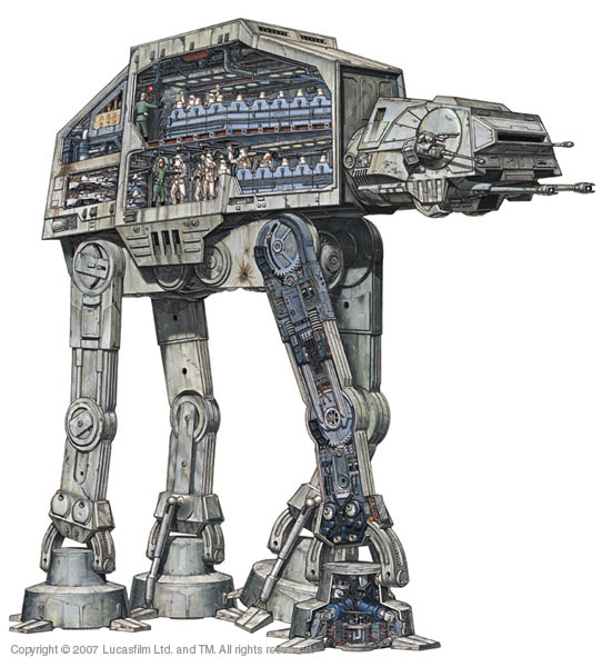
These are some of the images i used as inspiration for this concept piece:
I created this profile view of the same building quickly to define the potential area and shape of my tank asset. It's effectively just half the shape of the building, cut vertically.
Though it is not overtly linked to the design of my "engineering chamber" i thought it would be useful to first develop the look of the environment in which it is set. by re-establishing the context of my design i can design an assets that feel as though they are well considered and designed to compliment the surroundings that the player would encounter them in. i tried to build my design of the concept art that was created for Ba4 by my team mates Nathan and David.
This is a concept sketch that i created to roughly show my vision for the layout and structure of the game world setting (the facility) i loosely based it of David's external mood painting (figure 1) and Nathan's 3D map example (figure 2).
(Figure 1) is the only concept art i fad to go off for the outside of the building. in a way this is a blessing as gives me more freedom to experiment with my own design ideas while sticking too the design document.
(Figure 2) is a 3D version of the map (as showed earlier). in our design document it states that this design is based off a snowflake, and that this gives it structural strength. However, upon reflection i think that it makes the layout of the building (as a game world) is too rigid to and too symmetrical. though this is structurally strong, i don't think it looks interesting because of the lack of variation. i also believe that this would make it hard to navigate as each of the 8 areas have the same layout and structure because it has a layout that has 8 planes of symmetry.
I created this concept to show a single area of the facility. I did this sketch in profile because i thought it would be the clearest way to show the structure an layout of each level of the building. I have tried to improve upon the design ideas that were discussed in Ba4 to create a more interesting and well considered design. The basic shape of the structure is symmetrical, this theoretically would provide strength to the structure. However i changed the shape of the individual layers to hexagons because of their structural efficiency and shape.
I find the use of hexagons within structural design quite interesting, as the shape has mixed connotations in one sense it is a geometric shape, and as such has a very un-natural feel. However it is found extensively in the natural world due to its before mentioned properties.
Some of this design is also based off my new research into lunar engineering (the use of circular, modular connecting tunnels)
This piece of the building is one of the rooms that will contain the containment chamber in the game.
From the close up of my original concept i sketched a more detailed 3d view of the building to better illustrate the shapes and components of the building.
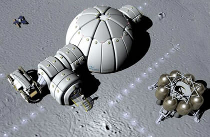
This piece of conceptual modeling for a lunar habitation served as useful extra reference for me for both my two previous pieces. I like the rounded edges of the plates that form the structure, and the way the building appears to be produced in sections, in the modular way i described earlier.
These are my primary concepts for the actual tank (engineering chamber) i just wanted to throw down some ideas of form, i was however unsatisfied with the result. i think i put this down to my not using my mood boards and other images for reference.
Using my mood boards as reference for form i worked on these further sketches. I tried to give an indication of functionality of the design as well as a suggestion of shape. I am taking into consideration the ergonomic needs of my design by looking back at the silhouettes of the creatures i created last year. These give me examples of the spacial use of the asset, and how the creatures fit in and interact with it.
To give myself a reference point for for the design extended world i created this mood-board, to show the kind of atmosphere i wanted to create in my concept work. From this point i can establish the feel and mood of the world i am creating assets for. I have used references from variety of sources, film, concept art, video games, and anime. the common theme of this mood-board is the use of dark shadows a pale blue- turquoise light and a science fiction setting. all of these are important aspects of my designs that i want to establish.
I created this mood-board with technological level and style in mind. It gives me some ques for how to go about deigning the various aspects like surface/texture and form of my asset. i chose a combination of fictional and real world designs to give myself some variety in my source material.
i collected these images mostly from the designs and worlds that i have already looked at because i thought that it was fairly important to keep m research consistent and coherent. However i have thrown some new references into the mix to keep things fresh, while i want my designs to be coherent i know that if they are too uniform they will risk looking generic and bland.
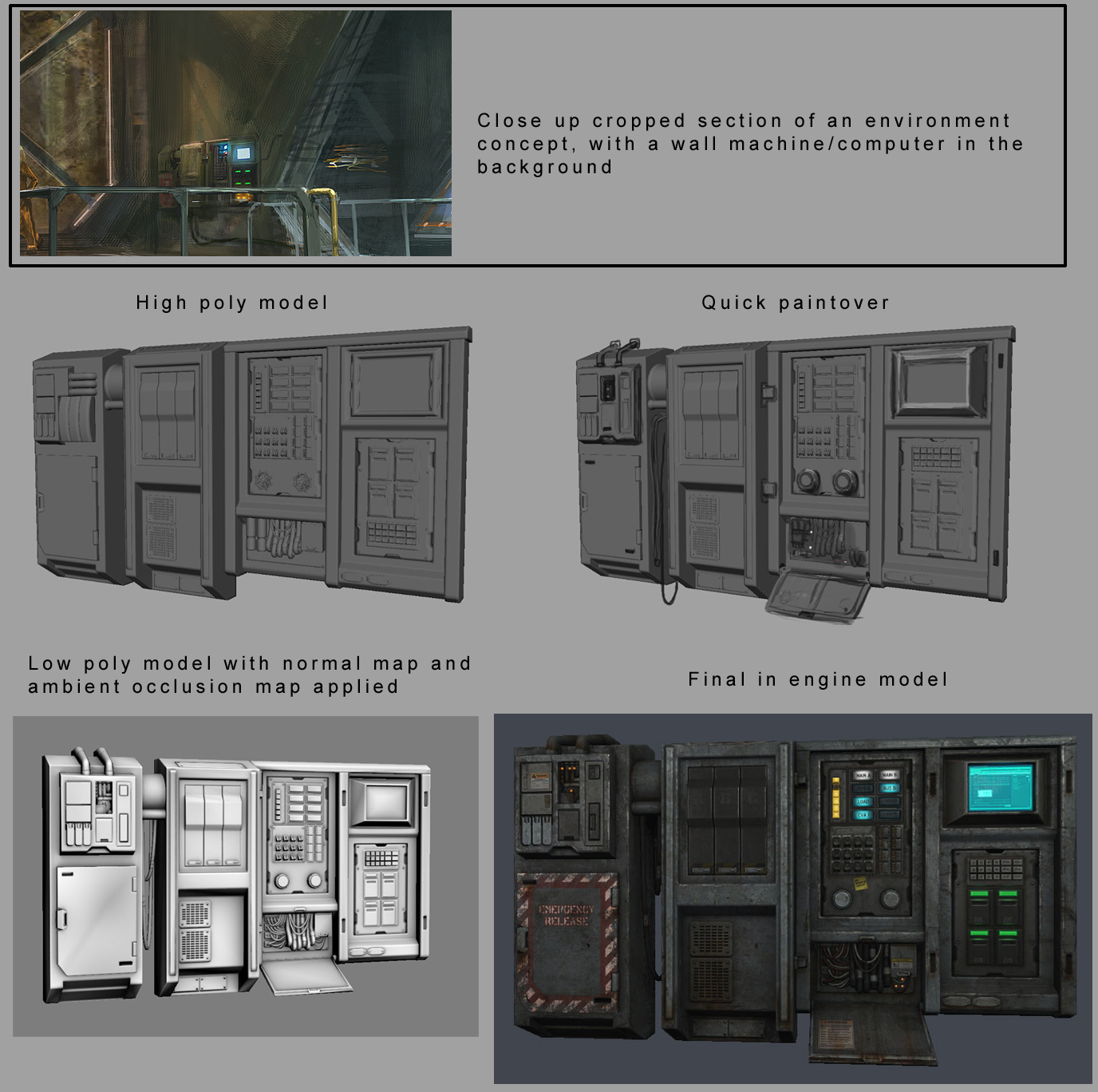
This concept sheet interested me in particular because of the way it presents its idea. It shows the various stages of the machine (in un-deployed, and deployed form) as well as giving specific annotations and detail of the various parts of the design. this would help a 3D modeler to visualize how the machine works, and bu extension why certain details are there (to allow it to move in a certain way) obviously i ill be modding an image from my own design so i will already have an idea of the functionality of the design, but this will be a useful practice to keep for productions i will be involved in int the future where i may have to pass on my work t others, where how the concept "reads" is very important.
The concept also includes a character in the concept to provide a scene of scale and context.
The above images are all examples of video game assets. After working on collecting source material for mood boards i felt it would be useful to see how the kind of design i was looking at would transfer into designs created specifically for video games, taking into consideration all the constraints put on design by the need to transfer them into playable props in a game engine.
I looked both at concept art and final "game ready" 3D models. looking at the concept art helps me to understand the best way to create and present my own game art, while looking at the final 3D assets helps me to understand better how assets need to look when they are finally finished and ready to be implemented into the game engine.
This example particularly interested me as it shows stages of how an asset can be taken from concept art to a game ready asset. Unfortunately it is a slimmed down version of what i will have to do, as it does not show the initial conceiving of the idea in initial conceptual sketches or the UV mapping stage, nevertheless it is a useful resource to refer back too.
I want the assets that i design to be an interesting type of the game design for phenotype. I also want it to be a man made structure, as this is an area of both 2D design and 3D modelling that i feel i need to improve on, and wish to test. For BA4 Nathan Russel created a 3D model of one of the types of tunnels that connect the main parts of the building together.
(map design by Nathan)
i will roughly be basing my room/area design off Nathans Map design, but with greater emphasis on my own vision for the world. I want to design a unnecessary part of the environment, as i feel that focusing on designing the tunnels was a bit of an unnecessary way to display our design ideas. An important part of the game design of "Phenotype" focuses on the customisation of characters. this is done in an "engineering room" in the game, which players must enter in order to update and or alter their characters appearance or moves in any way. the pretext of this in the game would be that when the creatures enter a specific device (like a cloning tank) their tissue and DNA dissolves (of the limb they are replacing) and is re-constructed onto the body out of fresh tissue and DNA.
I am using this scene from Prometheus as inspiration for what goes on in this tank, i think having different kinds of media will help me in creating a design that is iconic.
(clip explaining how the DNA corruption scene in Prometheus was created)
The assets that i am going to design will be part of this room set up. i want to design a variety of of props to populate the room, though i only intend to produce the engineering chamber itself as as a 3D model. it will be useful to have contextual designs of other props and the setting pf the assets to show a coherent design style and design progression.
I have started to collect inspirational images, and create mood boards. this is my progress, and thoughts so far:
(The Force Unleashed 2 trailer: still)
(The Force Unleashed 2 trailer: still)
I have looked at the game "The Force Unleashed 2" as my first inspirational material. I thought that the prevalent themes of cloning in the game would provide some interesting references. I like the use of color blue colored lighting in this environment, it provides a contrast between the dark metals and darker shadows in behind them.
I do however want to be considerate in my use of design cliche's, as i have mentioned earlier, the use of lighting in this way is common in science fiction, and i think, bordering on over-use.
I also like the design of the cloning tanks themselves, though the form is based on a simple cylinder, the large area of glass viewing screen frames the body's in the tanks well. This is an important functional aspect within the game that i need to consider. Part of the porousness of the tank is to display the players creature in an easily readable manner so they can make aesthetic adjustments through the customisation systems within the game. It would be poor design if the creature was obscured by part of the tank, impeding the players view.
There are 8 different playable races, each with 4 different style variables, and each of those with a further 4 variations of form (in the form of stages of the life cycle). I want to make sure my design can comfortably accommodate these designs, so that the design of the chamber will can remain consistent, therefore the containment space within the tank must not be too constrained.
(an example of the variations of one faction- Ba4)
Again, blue glowy lighting is a common theme here. This is kind of a visual prompt for myself to look closer at the art and design of avatar, initially at the industrial design aesthetic, but also at the use of human- machine interface. this will become very important for my later design work.
i like the shapes used within these objects (the tanks) they look simple and functional, yet clearly serve the purpose of framing the avatar inside. The top image is something i must try to stay away from, the container hugs the form of the character like a coffin. this design seems to be created from an ergonomic perspective, trying to comfortably contain the human within. A design of this type is too limiting of the shape of the occupant, as such it wouldn't work well as a vessel to house a wide range of differently shaped creatures.
This is my first mood board, for this collection of images, i wanted to put specific emphasis on form and shape. I envisage the main bulk of pod/ chamber i design to be symmetrical through both the x and y axis. i tried to look as related objects for the most part, with some more obscure images as inspirational shapes.
I first searched for objects related to the subject of my design, containment "pods" i gathered references of "cryo pods" from both alien and Prometheus. i wanted to keep a common, coherent theme through my research. To that extent i looked for imigary of "sleeping pods" as well as medical devices that are designed to "contain" the human form such as ct scan machines. from there i followed on with further images of medical equipment because of the visual links to operation and clinical environments.
Though i was relativity happy with what we produced as a team for Ba4, particularly in teams of game-play (playing styles, customization, and factions all worked really well) i think there was an inconsistency between our reference material, concept art, and final 3D renders of the game environment. Looking back on the work produced for this project, i can try to see where these elements went wrong, so that i can try to improve, and also not make these mistakes this time.
As i progress with my designs i will amend parts of the design document to make it my own work, finally producing a re-imagined design procurement coherent to the work i will produce.
Analysis of related works: As part of my research for BA4 I looked at the art and design of "Prometheus", "Avatar", and the "Star Wars" franchise. Placing particular emphasis on the design of the man made elements in these works, i created a collection of images for reference, Looking back, it seems that there wasn't enough communication between the team and myself, of the design elements in the mood/characteristics references and what i wanted to take inspiration from. i realise now the need to make more detailed notes alongside such images to correctly convey my vision. when not working in a team, as with this project said notes are equally important to help maintain a coherent design aesthetic, and to give me something to refer back to when i need to cross check a design idea. My notes should, take into consideration, form, color, characteristics, technique, mood and more.
(The art of Avatar)
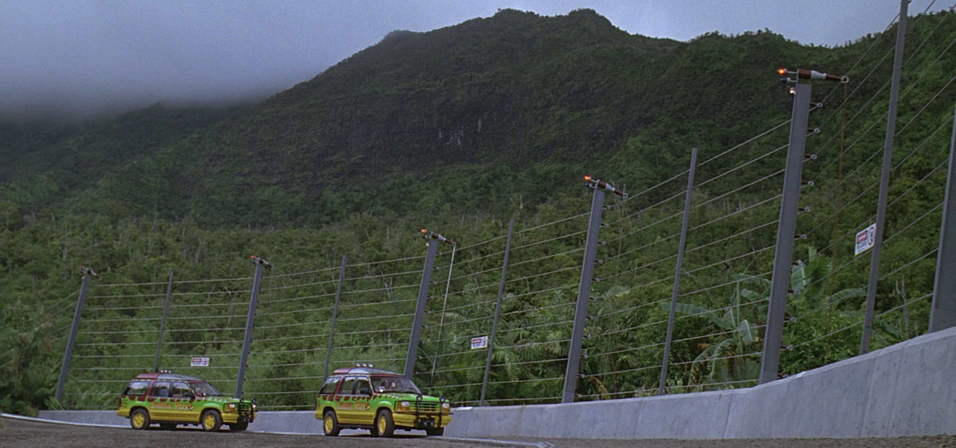
I chose this concept art piece from avatar as an example of the technology level that i thought would be appropriate in the game. I wanted the design to be somewhat fantastical, but within the realm of believability The picture reminded me of a discussion we had had as a team, about using Jurassic park for some reference material, as it shared some story themes, like the bi-engineering (in this case cloning) of dangerous animals, and their containment. we thought that we would have to design similar levels of security in the animal enclosures.
i have continued this research (that i started in the last project) to find examples of the images that sparked the these ideas.
(Jurassic Park)
(Jurassic Park 3)
(The art of Star wars the Clone Wars: Kamino design)
It was the stetting of this painting that primarily interested me. I thought that within the story of the game, it would make sense that the facility (the stetting/environment of the game). I also wanted to use these buildings as a reference for the scale of the environment we were creating, based upon the idea that as we were designing a large scale MMORPG game, the towers, and forms of the buildings, and the expanses of testing facility's in the facility would effectively form what would be the mountains, hills and plains such games that are set in more traditional locations.
From that point, i imagined that the buildings would be based off some kind of tier/ level structure, i thought that this would create an interesting game environment to play in, and would produce a large amount of available play-space for a game with an indoor setting.
A design incorporating the aesthetic/ layout of the Kamino buildings (above) and some structural inspiration taken from paintings of the Tower of Babel, or the film design of Minas Tirith from the Lord of the Rings franchise.
(Tower of Babel)
(Minis Tirith: The Lord of the Rings)
(The art of Star wars the Clone Wars: Kamino design)
For this sketch (above), i also wanted to give an example of the scale of the building, i thought the use of characters in the picture would give a better indication of scale and perspective.
(The art of Star wars the Clone Wars: Kamino design)
I liked that this image went into further detail of the buildings. the perspective of the picture, ad the organic curves give the buildings the same profile a rolling hilly landscape would have as it turned to a mountainous region. it was this picture that provided me with the visual link to connect the use of large scale buildings and their forms as the actual landscape and its environmental landmarks.
(The Art of Prometheus: ship interior)
(The Art of Prometheus: ship interior)
These images from the concept design of the ship Prometheus from Ridley Scott's film of the same name, also provided examples of the level of technology that i thought would be appropriate for the game world. Prometheus is set in 2089, a similar time in terms of technology (theoretically) as the setting for Phenotype, and as such provided the best template to work from.
The Prometheus and Alien franchises also provided a good deal of reference in terms of mood. Unfortunately i neglected to source any images of the man made design in Alien (the spaceships and buildings) and used it more as a guide for the design of organics within the game as this also fitted the dark design ethic we wanted to stick to.
For this project i will be designing the interior of a room, which is inherently a man made structure. therefore it is important that i gather further reference images, for concept art and mood paintings that are more applicable to me now. I still feel that these reference points are compatible and relevant to my vision of the assets that i intend to create, i want to gather fresh resources from these areas and more that i think will help me in a manner more specific to my BA5 project, as i don't want to rel solely on the material that i had gathered previously.
"Open the pod bay doors, HAL..." When i think of "retro" science fiction films the first thing that leaps to mind is 2001 A Space Odyssey. Undoubtedly a classic of the genre and of film making in general, it sets the visual cornerstone for visual design in modern sci-fi. This is the film (and aesthetic) i had in mind when i chose to base "Phenotype" off "hard science fiction". For me, it has always stood out for its believable design, which in turn, in turn helped me to engage with and believe in the situation and roles of the of the characters.
The abundance of clean, simple, white surfaces in the 2001 spaceships gives them a sterile, no nonsense feel, and the technology, though dated in comparison to modern standards is very reminiscent of actual spacecraft of the time.
It's clear that a great deal of care was taken in the design of the film to make it feel authentic, and genuine. Researching the design of the film however, lead me to discover that Stanley Kubrick (director) went as far as employing Frederick Ordway, and Harry Lange, (who had worked with NASA on vehicular concepts) as consultants.
Visual tropes and motifs are commonly used in many genres, as a way of providing recognizable themes (colors, shapes, and effects) that the audience can pick up on to quickly understand the type of style that the design team is going for. For example, white (in the western world) tends to denote purity, clean, modern design- the design ethic that company's like Apple tend to follow, when accompanied with simplistic, minimalistic forms this gives a clean "futuristic" look.
A Dystopian Future:
Post Apocalyptic settings are a common (some might say over-used) sub-genre of science fiction, the setting is an example of a dystopia. As with many others it often uses common visual themes and devices to to quickly set up the scene.
(The Road)
(Fallout 3)
(Borderlands)
The common theme here is obviously brown, lots of brown. In contrast to the pure symbolism of white, and its use in entertainment media, brown is used to suggest everything dirty and dilapidated. Thus is a commonly recurring theme in a variety of different media platforms.
Miss-matched, salvaged components, combined in an improvisational manner is also typical of this genre. from, vehicals to buildings to clothing, this style of design will immediately scream post-apocalyptic to most discerning audiences without the need for description. I mention this, as i think it is a useful way of none verbal storytelling and scene setting that can be used to tell an audience that something bad has happened, but sill withholding story details.This technique shows extreme age of an object, or at least high usage.
(Mad Max)
It is important that i bear this use of detail in mind in the designs of my own props and setting. Correct usage of color, and knowledge of their connotations is also important for both 2D and 3D artists. I have found a useful chart that shows the various meanings of colors to use as reference points for my future work.
"Dont follow the lights..."
This next one is one of the more recent tropes used in the sci-fi arsenal. There is a current trend in science fiction of using an unnatural light blue light as a signifyer for anything scientific, technical or other-worldly, again, this theme spans various different mediums.
interestingly however, If i look at the chart, the color seems to denote tranquility, peace and wisdom over technology, I also know that blue also indicates cold temperatures.This leads me to deduce that colors have different meanings and uses dependent on their application, location and various other factors. it looks like more color theory is in order.
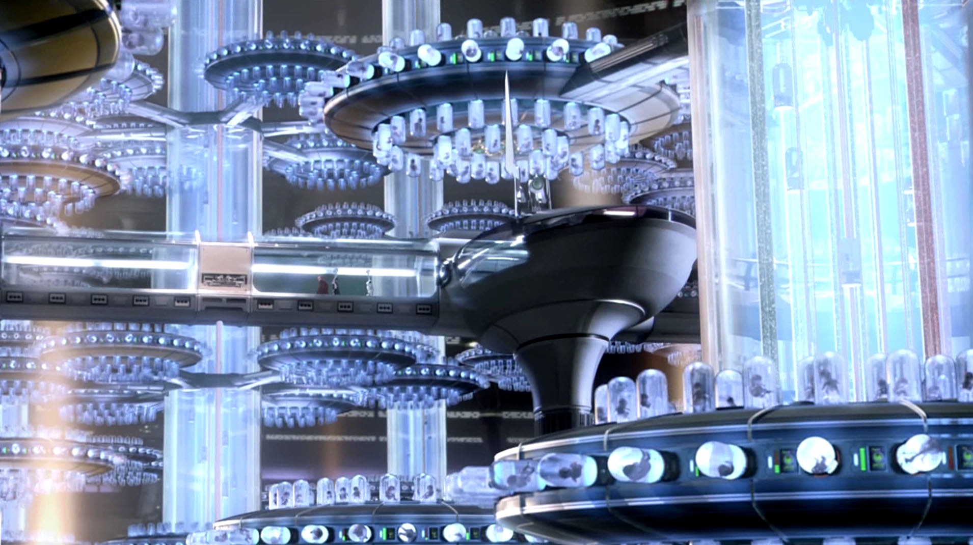
(Star Wars, Attack of the Clones: a cloning facility screenshot)
- A cloning facility is obviously a place of high levels of technology
- the light area and bright light link to my previous comments on the use of white in sci-fi
(Skyline)
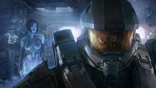
(Halo 4)
- The character in the back is a hologram, again this is a futuristic technology
(Iron Man suit)
- Though the suit itself is red and gold (which of course have different meanings), the light emitted from its power source has a light bright blue glow
- more than just examples of use of color these are examples of the use of lighting, and its combined uses with lighting.
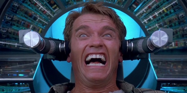
An obvious example of how this tool has begun effect the design of sci-fi, is the 2012 remake of "Total Recall".
Origional (1990):
(Total Recall 1990)
Remake:
(Total Recall 2012)
The second image looks significantly more sophisticated, all thanks to the use of certain devices that bring the visual feel of the film up to date, and in line with public expectations.
By keeping in mind these, and other formulas of the genre, and knowing the correct place to use them, i can begin to design contemporary looking environments, or use this knowledge to subvert expectations of the genre.
Because i feel that my research for BA4 was such a week point in that project, i think it is particularly important this term that the research my reflective journal (this blog) is thorough. This is a key aspect of my revision of BA4, as i feel that there are many areas in our design that would benefit from greater consideration, research, and reference.